This is a hands-on lab that will extend your use of graphical analysis techniques as well as teach you some fundamentals of laboratory work. In the process, you'll learn about the simple pendulum. You'll use this knowledge over and over again in your study of physics. |
Goals
- Determine how the period of a simple pendulum is influenced by a) the mass of the bob, b) the angle of release, and c) the length of the pendulum.
- Use the relationship to design a pendulum that has a period of 1.000 s.
Introduction
The controlled experiment
You were introduced to the simple pendulum in L101. In that lab, a pendulum was used to help you learn how to reduce uncertainty in timing. In this lab, you'll actually learn about the pendulum itself and what what things influence its period. You'll also learn how to determine functional relationships between variables.
 One
common type of laboratory investigation is to determine the relationship between
physical variables. For example, consider a simple pendulum which is composed of
a compact weight (bob) that is hung from a string attached at its upper end to a
fixed support. Suppose the goal of the investigation is to determine which
variables influence the period of the pendulum, that is, the time for the bob to
execute one complete cycle over and back. Some variables whose influence one
could investigate include the length of the string, the mass of the bob, and the
angle from the vertical at which the string is released. The latter three
variables are termed independent variables, because one selects their
values in carrying out the experiment. The period is termed the dependent variable, because its value may depend on the values of the independent
variables.
One
common type of laboratory investigation is to determine the relationship between
physical variables. For example, consider a simple pendulum which is composed of
a compact weight (bob) that is hung from a string attached at its upper end to a
fixed support. Suppose the goal of the investigation is to determine which
variables influence the period of the pendulum, that is, the time for the bob to
execute one complete cycle over and back. Some variables whose influence one
could investigate include the length of the string, the mass of the bob, and the
angle from the vertical at which the string is released. The latter three
variables are termed independent variables, because one selects their
values in carrying out the experiment. The period is termed the dependent variable, because its value may depend on the values of the independent
variables.
In order to determine how each of the independent variables may influence the period, one needs an experimental design in which only one of the independent variables is changed at a time while the others are held constant. In this way, if an influence (or lack thereof) is found on the period, one can be fairly confident that the independent variable that was changed is the variable that influenced (or didn't influence) the period. Such an experiment is called a controlled experiment. By the way, the reason we said fairly confident is because there's always the possibility in dealing with the natural world that there are variables that the experimenter has overlooked and has not controlled. For the case of the pendulum, for example, suppose you carried out the experiment in an elevator that was moving up and down between floors. You would discover some strange results and find it difficult to reach conclusions about how the independent variables affected the period. That's because the elevator accelerates and decelerates and, as it turns out, such motion influences the period of a pendulum. Of course, it's not likely that you would do this experiment in an elevator and, if you did, you would probably guess that the motion of the elevator influenced the results. That's part of being a competent scientist. However, even if you're competent, you can still overlook variables. An example might be your location on the surface of the Earth. Location, in fact, influences the period, although the effect is so small that one typically doesn't notice it. But if you were making very precise measurements, you would have to take the effect into account.
The typical way to carry out an experiment to investigate the possible influence of an independent variable on the dependent variable is to measure the value of the dependent variable for several values of the independent variable. A graph is then made of the dependent variable vs. the independent variable in order to visually represent the relationship between the variables. Graphical analysis is then used to determine the functional form of the relationship. In L103, you learned how to determine the relationship between the distance traveled by sound and the elapsed time by plotting a graph, drawing a line of best fit, and determining the equation of the line. So you already have some experience with the process of graphical analysis. In this lab, you'll do the graphical analysis using software called Logger Pro. You'll also learn how to deal with non-linear relationships.
Prelab
- Assemble the equipment from the list below.
- Download and install LoggerPro 3 if you haven't already done so. (See instructions here.)
- Study this guide on Graphical Analysis for a Non-Linear Relationship.
- Do the WebAssign assessment L105PL.
Equipment
From your lab kit:
- protractor
- white nylon string
- film canister with hook and 10 washers
- meter stick (You may use the tape measure if you don't have the meter stick.)
You supply:
- tape, such as masking tape, duct tape, or blue tape (Blue tape is easiest to work with. We recommend that you get a roll to use throughout the year.)
- a table or desk to use as a pendulum support
- stopwatch or stopwatch application that reads to a precision of at least 0.01 s (same as you used in L101)
Set up and Protocol
Allot 90 - 120 minutes for the set up and data collection.
While the equipment set up for this lab is simple, attention to the following instructions will help you in obtaining good data.
The bob
-
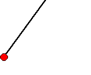
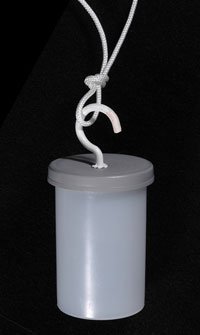
The bob will be a film canister containing washers. A hook on the lid of the film canister allows you to hang it on the string. Tie a knot in the end of the string for this purpose. See Figure A below
-
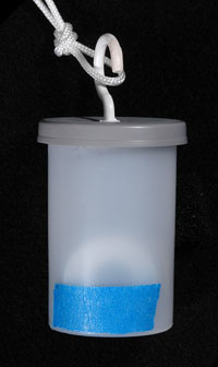
When you place the washers in the canister, orient them with their planes vertical rather than stacking them horizontally. See Figure B. The reason for this is that you'll using different numbers of washers in order to change the mass in one part of the experiment. The length of the pendulum is measured from the center of support to the center of mass of the bob. For a controlled experiment, you need to keep the length constant if your determining how the period depends on the mass. If you stack the washers horizontally, then the center of mass rises as you add washers; hence the length of the pendulum changes. By orienting the washers vertically, the center of mass stays the same as you add or take away washers.
-
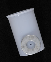
Now you'll need to mark the position of the center of mass on the outside of the canister. In order to mark the center of mass, hold a washer as shown in Figure C with one edge coinciding with the bottom of the cannister. Then mark the center of the washer. If you're marking on a black canister, you could prick the spot with a pin. Then remove the washer and use a piece of tape to mark the spot as shown in Figure D.
Figure A Figure B Figure C Figure D Attaching the canister to the string
Inserting washers vertically into the canister Marking the center of mass The marked bob

Fixing the point of support
-
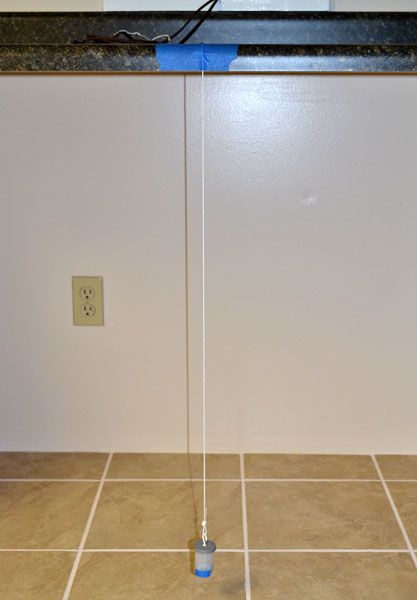
You'll need a table with under counter space for the pendulum string to swing. A high surface such as a bar is best, but a work desk will also do. See Figure E. Note that a piece of tape holds the pendulum string at a fixed height. Adjust the height initially with the bob a few centimeters from the floor. There needs to be enough clearance to either side so that the bob won't hit anything when the string is released from an angle of 60o with the vertical.
-
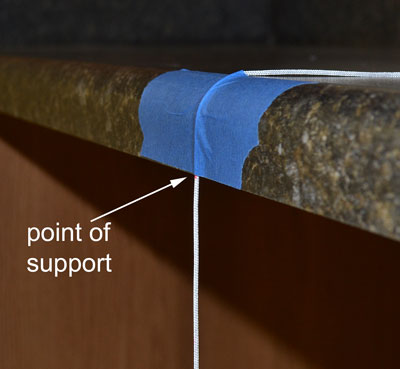
Figure F shows a close up of the point of support. Note the tape comes down to the lower edge of the table. This minimizes any friction that the string would experience in sliding across the table's surface. When you tape the string, either use wide tape or several overlapping pieces of narrower tape. This will help prevent the string from sliding under the tape and lengthening the pendulum. In order to check whether this has happened during the experiment, make a mark on the string at the point of support. If the string slips, you'll know it, because the mark will move down.
Figure E Figure F
-
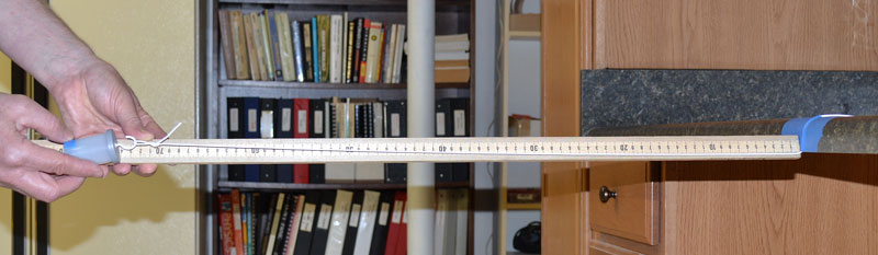
It can be difficult to measure the length of the pendulum, because the endpoints are widely separated. Figure G shows a method that works well. Pull the string horizontal, being careful not to rip the tape. Butt the 0 end of the meter stick against the edge of the table. Then read the position of the center of mass at the bob end. Normally, it's not a good idea to read from the end of a meter stick, since the end may be worn from use. In this case, the difficulty of the measurement means that you can't expect to read to a precision better than 1 mm; hence, using the end of the meter stick as an endpoint is acceptable.
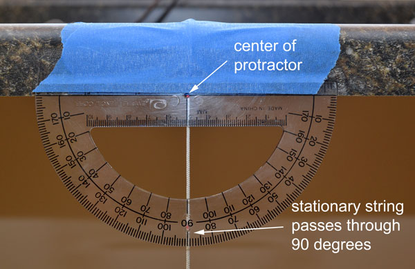
- Figure H shows how to position the protractor for angle measurements. Be sure that the center of the protractor is at the pivot point of the pendulum and that the string, when stationary, passes through the 90o mark. Then tape the protractor in place.
Figure G Measuring the length of the pendulum Figure H Positioning the protractor
From the set up considerations described above, you can see that the simple pendulum really is simple. Yet, there's much physics and experimental technique to be learned from it. By the way, later in the course, you'll study another kind of pendulum which is a bit more complex in the physics but even easier to set up. That's a pendulum that has its mass distributed along its length instead of being concentrated at the end. The concentration of mass at the free end is what makes the simple pendulum simple.
Timing
You should already have your stopwatch or stopwatch app ready to go. The method of timing the period will be the one that you used in Part 2 of L101. In order to decrease uncertainty, you'll time 10 consecutive cycles. Remember to let the pendulum swing away from you and return once before starting the watch. For each set of independent variables (length, mass, angle), you'll take 5 trials of these measurements of 10 cycles. By doing so, you'll then be able to calculate the percentage mean deviation to get a handle on the timing uncertainty. This method was discussed in Part 1 of L101.
Protocol
A protocol in science is a way of doing something. In this lab, for example, the protocol is that of a controlled experiment, discussed earlier. The initial set up with the longest length of string, a mass of 10 washers, and an angle of release of 10o from the vertical will be considered the control. When you test the influence of mass on the period, you'll decrease the number of washers by 2 for each set of 5 time trials, but you'll keep the angle of release and length constant. When you test the influence of angle on the period, you'll return the 10 washers to the canister. Then you'll do sets of 5 time trials for angles in 10o increments while keeping the length constant at its original value. When you test the influence of length on the period, you keep the mass at 10 washers and always release the pendulum from 10o.
Now it's time to start taking data.
Data recording
Download and print this sheet: Data record. This is where you'll record your original data. You'll scan and submit your original data to WebAssign L105D in advance of the final report. Title your file L105D-lastnamefirstinitial.pdf. By submitting your data before the report, this gives the instructor the opportunity to review your data in the event that you need to retake some of it.
You won't be allowed to submit the final report until the instructor has reviewed and approved your L105D file.
Regarding data recording:
Use pen and remember the rule for recording data: Don't obliterate original data. If you think data is wrong, cross it out with a single line and write the new value beside the old.
When to ignore data: There are some situations where you would be justified in not recording data in your data table. Here are some examples:
- As the pendulum swings, you may notice that the string occasionally rubs against the protractor or the bob bumps into something at an extreme of its swing.
- You obviously started/stopped the stopwatch early/late.
- You lost count of oscillations.
These are situations where there's an obvious mistake or lapse in procedure and you immediately realize that the data is compromised. Don't, however, let yourself be tempted into playing games with the timing, for example, ignoring readings that don't correspond to some preconceived idea of what you think the time should be. We mention this, because we've seen students do it in an effort to reduce the variation in their results, thinking perhaps that this will somehow get them a better score. It won't; it's a poor scientific practice.
Method
Part A. Period of the Pendulum vs. Mass of the Bob
The method is divided into three parts, one part for each of the independent variables. In this part, you'll test the influence of mass. Your controls will be the string at its longest length and the angle of release from the vertical at 10o. Take 5 time trials of 10 consecutive cycles for 10, 8, 6, 4, and 2 washers.
Part B: Period of the Pendulum vs. Angle of Release
Your controls will be the string at its longest length and a mass of 10 washers. You'll test the influence of the angle of release. As the pendulum swings through consecutive cycles, you'll notice that the maximum angle reached by the string decreases. If the period depends on the angle, then one may reasonably wonder what value of the angle the measured period corresponds to. In order to help address this situation, note the angle when you start timing and the angle when you stop timing. Since it's difficult to read angles as the pendulum is swinging, a precision of 1o in your readings is sufficient.
Change the initial angle in 10o increments starting with 10o and ending at 60o. If you have sufficient working space and want to use increments of 15o, thereby increasing the maximum angle to 85o, that's fine.
As the angle increases, the string experiences greater tension due to increased speed of the bob. Therefore, there will be more of a tendency for the string to slip through the tape. Check it frequently for slippage.
Part C: Period of the Pendululm vs. Length
Your controls will be an angle of 10o and a mass of 10 washers. In order to make it easier to measure the length of the pendulum, you may remove the protractor at this point and visually estimate the angle of 10o. This method is acceptable due to the fact that small angles have an almost imperceptible influence on the period. You may have noticed this while taking data in Part B. An error of a few degrees in your angle estimate isn't going to matter.
Start with the longest length and select the intermediate lengths so that the final value of length is about 10 cm.
Calculations
For each set of 5 time trials, calculate the mean, deviations, mean deviation, and percentage mean deviation. This is a tedium that no one need endure in the age of spreadsheets. If you don't know how to use formulas in spreadsheets, it's a good skill to have. We're not requiring that at this point, though, as there are other priorities. You can learn to use spreadsheet formulas at a later date. This time, we're providing a spreadsheet calculator. Download it here. Here are some things to take note of.
- The spreadsheet has tabs at the bottom for each part of the method.
- If you see a red triangle in the corner of a cell, that means there's a hidden comment. Place your cursor over the cell to make the comment appear.
- Enter data only in the cells with yellow highlight.
- As you enter data, means and deviations will be calculated automatically.
You'll submit your completed spreadsheet with your final report. The filename is L05C-lastnamefirstinitial.xls.
Analysis and Interpretation
You'll use Logger Pro for the graphical analysis. For each part, you'll make a graph of Period vs. Independent Variable and then use the graph to reach conclusions about the relationship between the variables. The process will be similar to what you did in L103 for the distance traveled by sound versus the elapsed time. However, Logger Pro will automate the process of plotting points and fitting the data. Also, in one case, you'll need to re-express a variable in order to linearize a relationship.
Part A. Period of the Pendulum vs. Mass of the Bob
In this part, we'll present in detail the steps for using Logger Pro to plot a graph of Period of the Pendulum vs. Mass of the Bob. In Parts B and C, we'll expect to carry out similar processes with less guidance. In the instructions below, we'll use the convention that titles in Logger Pro are in boldface and labels that you enter are in italics.
Completing the Data Table
- Open Logger Pro. Double-click on the label Data Set at the top of the data table. Change the name to Data Set Mass.
- Double-click on the column heading, X. In Manual Column Options under the Column Definition tab, for Name enter Mass. Enter the same thing for the Short Nm and wshr for Units. Then click on the Options tab. For Displayed Precision, select Decimal Places. In the drop-down box, select 0. Then click Done.
- Use a similar proces the change the name of the Y variable to Period with units of s. For Displayed Precision, enter the appropriate number of decimal digits for the period. Recall that you measured the time for 10 cycles to a precision of 0.01 s, but when you divide by 10 to get the period, you add a decimal digit.
- In the main menu, select Data -> New Manual Column. Enter %MeanDev for the Name and Short Nm. There are no Units. The Displayed Precision will be 1 decimal digit.
- Now you can enter your data. For the Period, enter the mean of the 5 trials from your spreadsheet. Of course, you'll need to divide the time for 10 trials by 10. Please do that in your head. Your completed data table will have 5 rows.
- There's one more thing to do to complete the data table. Double-click on the column heading, Period, and select the Options tab. Select Error Bar Calculations, Percentage, and Use Column. In the drop-down box, select Data Set Mass | %MeanDev. When you click Done, the message beginning "You have chosen to use a column..." will appear. Click Yes.This selection will have the effect of using the %MeanDev column to generate error bars for the Period.
Note about error bars: Error bars provide a visual display on the graph of the uncertainty in the data. One can display both vertical and horizontal error bars for the uncertainties in the vertical and horizontal variables. For the current experiment, we chose only to display vertical error bars to represent the uncertainty in the period. These show as vertical lines, capped with short horizontal bars, that extend above and below the data point an amount equal to the absolute uncertainty. While you used %MeanDev to generate the bars, these values are automatically multiplied by the corresponding Periods to obtain the absolute uncertainties in seconds. If you can't see the error bars on the graph, they may be too small to appear. That simply means you have low uncertainty.
Completing the Graph
- Chances are, Logger Pro has already plotted a graph of Period vs. Mass. If not, you can select the variable for each axis by double-clicking on the axis name and selecting the appropriate variable. Period will, of course, be plotted on the vertical axis, since Period is the dependent variable. Logger Pro knows this, because you entered Period for the Y variable.
- Double-click anywhere on the graph to bring up the Graph Options dialogue box. Enter the Title: Period of the Pendulum vs. Mass of the Bob. Note that the dependent variable before the independent variable. This is conventional procedure in physics. Note also that descriptive phrases--of the Pendulum and of the Bob--are included in addition to the variable names. Such descriptive phrases are expected in all your graph titles.
- Still in Graph Options, the only things selected under Appearance should be: Point Symbols and Y Error Bars. By all means, do not select Connect Points. (There will be only one exception to this rule the entire course, and we'll point that out to you at the appropriate time.)
- Still in Graph Options, click the Axes Options tab. Do not enter axis labels, as that would override the labels that have been selected automatically. Under Y-Axis, for Scaling, select Manual. For Top, enter 2 and for Bottom 0. This will scale the vertical axis from 0 to 2 s. Later, we'll explain why we had you make these choices. Under X-Axis, for Scaling, select Manual. For Left, enter 0 and for Right 12. Click Done.
Interpretating the Graph
Now we'll show you why we had you select the manual scaling options that we did. At the top of the screen, single-click the symbol ![]() . Note that the graph auto scales. Now the error bars seem much bigger. The data also appear to have a trend. But examine the vertical scale. It shows only a small range of periods. Effectively, auto scaling has magnified any errors and trends out of proportion. This is a deceptive display. Of course, tricks like this are used all the time in advertising. You have to be wary of them. Always examine the scales. For the present case, in order to provide a more appropriate visual representation, we choose to scale from 0. In fact, we'll make this a general practice in this course unless we need to magnify a portion of a graph for closer examination. In order to return to the previous scaling, type CTRL-Z on a PC or CMD-Z on a Mac.
. Note that the graph auto scales. Now the error bars seem much bigger. The data also appear to have a trend. But examine the vertical scale. It shows only a small range of periods. Effectively, auto scaling has magnified any errors and trends out of proportion. This is a deceptive display. Of course, tricks like this are used all the time in advertising. You have to be wary of them. Always examine the scales. For the present case, in order to provide a more appropriate visual representation, we choose to scale from 0. In fact, we'll make this a general practice in this course unless we need to magnify a portion of a graph for closer examination. In order to return to the previous scaling, type CTRL-Z on a PC or CMD-Z on a Mac.
Now here's something else you may notice. Are the error bars about the same size as the point symbols? That's typical in this experiment. It's also a good thing if your uncertainties are small enough that the size of the point symbol represents the uncertainty.
- From the main menu, select Page -> Page Options. For Title, enter Analysis. Click OK. This is how you give a descriptive title to a page.
- Now from the main menu, select Page -> Add Page. For the Title, enter Interpretation. Click OK. On the new page, insert a text box by selecting Insert -> Text from the main menu. Drag the text box to fill the screen. This is the page on which you'll answer questions, starting with the next item.
In order to avoid confusion, label your work on the Interpration page with the same section headings and numbers as used in these instructions. Your first entry will be under the title Part A and will be numbered 3.
- A visual inspection of your data should indicate that any relationship between Period and Mass is, at most, weak. In order to examine this closer, you can fit a straight line to the data. From the main menu, select Analyze -> Linear Fit. Give the slope (value and units) of the fit. Now examine your data and calculate a typical absolute uncertainty in the Period, that is, multiply the %MeanDev by the corresponding Period. Remember to divide by 100, since you're multiplying by a percentage. Now compare the absolute uncertainty in the period compare to twice the slope, which represents the amount that the period changes per 2 washers added? Chances are, the values aren't much different. What this indicates is that any trend is lost in the noise. That's a phrase physicists like to use to indicate that any perceived trend is no bigger than the uncertainty in the data. The confidence level in the perceived trend is essentially 0. There is no foundation, based on the data, for concluding that the period of the pendulum depends on the mass of the bob. (If your data doesn't show this, that may be indicative of a systematic error such as gradual slippage of the string.)
This experiment produces a null result in that no dependence of period on mass is found. This, in itself, is an extremely important result. Being null doesn't make the result unimportant. The lack of dependence on mass is actually a manifestation of one of the foundational ideas of physics, the equivalence of gravitational and inertial mass. We'll say more about this in later chapters after you've studied gravitational force and Newton's 2nd Law. However, you're probably already aware of another manifestation of this equivalence principle, namely, that objects of different mass falling side-by-side in the absence of forces other than gravity fall at the same rate (acceleration).
While this is the end of the story of Period vs. Mass for this experiment, it's not necessarily the end of the story for all time to come. The principle of the equivalence of inertial and gravitational mass is something determined experimentally. Experiments much more sensitive than the one you did have been done to test the principle. This is not to say that even more sensitive experiments in the future wouldn't show that there could be a non-equivalence. That's called doing science.
This completes the analysis and interpretation for Part A. There's no need to prepare a matching table for your fit, because a null relationship was determined.
Part B. Period of the Pendulum vs. Angle of Release
Completing the Data Table
You'll need to create a new data set. Here's how.
- In the main menu, select Data -> New Data Set. Drag the table open wider to see that three columns have been added. Double-click on Data Set Mass 2 above the 3 new columns and change the name to Data Set Angle.
- Now double-click on the column heading for Mass and change the name to Angle. Enter the corresponding units and Displayed Precision.
- Double-click on the Period column. Under the Options tab and Use Column, make sure Data Set Angle | %MeanDev is selected. It's important here to select the right data set, since there are two %MeanDev columns.
- Now you can enter the data. You'll have 6 rows, one for each value of the Angle. Enter the average of initial and final values.
Completing the Graph
- In order to add a graph for Period vs. Angle, from the main menu select Insert -> Graph. You'll need to change the variables plotted on the axes. Single-click on the vertical variable and select More. In the Y-Axis Options, expand Data Set Angle and select Period. Uncheck anything else that happens to be checked. Then select the scaling similar to how you did that for the last graph.
- Carry out a similar process for the horizontal axis. Of course, the variable you'll select is Angle.
- Title the graph and remove any connecting lines between points.
- Rearrange the page now by selecting Page -> Auto Arrange in the main menu.
Interpreting the Graph
- For the last graph, we led you through the interpretation. This time, we'll leave it to you to discuss any relationship that you perceive between the variables and justify your conclusions. Use item 3, Part A, as a guide. Type your response, appropriately labeled, on the Interpretations page. (If you perform a fit, a matching table is not required for this part.)
This completes the analysis and interpretation for Part B.
Part C. Period of the Pendulum vs. Length
Completing the Data Table
- Create a third data set and name it Data Set Length. Change the variable Mass that's created with the new data set to Length and select the Displayed Precision appropriately. Check to make sure that Period under the new data set uses Data Set Length | %MeanDev for error bars.
- Enter the data.
Completing the Graph
- Insert a new graph to plot Period vs. Length and scale it from 0. Title the graph and remove any connecting lines.
Re-expressing the Data to Linearize the Relationship
Examine your graph of Period vs. Length. At first sight it may appear linear; however, you can quickly dispense of that idea by doing a linear fit. If you consider also that you would expect the period to fall rapidly to 0 for lengths below 0.1 m, you can see that there's a pronounced curvature. Recall the third problem of WebAssign L105 which involved the same relationship. In that case, the Period was expected to depend on the square root of the Length. There's a reason based on the theory of the pendulum to expect such a dependence. However, it's too soon in your study of physics to discuss that theory. Instead, we'll use this situation to give you the opportunity to practice the process of re-expression and linearization. Expecting that the relationship between Period and (Length)1/2 is linear, a new graph must be plotted with (Length)1/2 as the independent variable. Follow the steps below to do that.
- In the main menu, select Data -> New Calculated Column. For Name, write sqrt(Length) and for Units sqrt(m). For Destination, select Data Set Length. Uncheck Add to All Similar Data Sets. Under Expression, click on Functions and select sqrt. Next click Variables (Columns) and select Length. Under the Options tab, select the Displayed Precision the same as for the Length. Click Done. The new variable should appear in the data table under Data Set Length.
- Now you'll make changes to your graph of Period vs. Length. Double-click on the graph and change the name of the independent variable in the title to sqrt(Length). Then click on the horizontal axis label and change that to sqrt(Length). Just like that, you now have a graph of Period vs. sqrt(Length). It's even possible that the linear fit automatically readjusted itself. Nevertheless, it's a good idea whenever changing the data in a graph to reapply any fit. Remove the existing fit by clicking the 'x' in the upper left-hand corner of the fit results box. Then reapply a linear fit. Hopefully, this one looks much better than the last and passes near the origin. Re-expression and linearization is complete. This is a process, by the way, that you'll use many times in this course. Chances are there will be a problem on the AP Exam that also requires it.
Interpreting the Graph
- Next you'll construct the matching table for the fit. You constructed a matching table in L103, so you're familiar with the process. When using Logger Pro, enter your matching table into a text box. In the main menu, click Insert -> Text. Type your column headings for the matching table. Unfortunately, Logger Pro isn't designed for creating tables in text boxes, so you'll need to use spaces to align columns. You can use the vertical bar character, |, as a separator like this: Math | maps to | Physics | Fit Value (graph) | Value (exp) | Units. In your table, you'll have blanks for the Physics symbol and the expected value of m. Later in the course, you'll learn what to expect for these. (We'll return to the pendulum in Chapter 8.)
- Below the text box, write the equation of the fit. Review the graphing guidelines if necessary.
- Select Page -> Auto Arrange to arrange all boxes so that they don't overlap. You may notice that the table you created in the text box goes out of alignment. Don't try to fix this. When the teacher checks your file, he'll simply drag the text box larger to restore your formatting.
Application: Using the Relationship
The process you carried out in which you collected data and then used it to determine a relationship is called inductive reasoning or induction. The nature of this process is that it begins with specific information (in this case, data) and concludes with a general relationship that can be used to predict values that were not part of the original data set. For example, you could use the equation of fit to calculate what length a pendulum must have for the period to have a particular value. This process of predicting something specific from a general relationship is called deductive reasoning or deduction. Scientists use induction to discover relationships, and they use deduction to make predictions based on known relationships. These processes are part and parcel of the scientific method.
Do the following on the Interpretation page of your Logger Pro file.
- Solve your equation of fit algebraically for the Length. Then calculate what Length the pendulum must have for the Period to be 1.000 s.
- Test your calculated prediction. Set up a pendulum with a length as close as possible the the length that you calculated. We suggest laying the string out on a table first, measuring the distance that you want, and then making a mark on the string at the desired pivot point. Then tape the string to the table's edge. Take 5 time trials of 10 consecutive cycles and calculate the mean period and % mean deviation. Give all results on the Interpretation page.
- Calculate the experimental error between the measured mean period and the expected value of 1.000 s. See the formula for experimental error in Lab FAQ. Write the formula and show your substitutions and final result on the Interpretation page.
- How does the experimental error compare to the % mean deviation of the measurement of period? Comment on how good your "seconds pendulum" is.
Error Analysis
Quantitative
You've been carrying out a quantitative error analysis while you've been working on the data and analysis, so there's no need to do anything more for that.
Qualitative
- In previous labs, you discussed potential sources of error without quantifying them. We pointed out in L101 that when you describe a potential source of error, you should say how you would expect it to affect the results and why. With that in mind, describe a potential source of error in each part (A, B, C) of the experiment. These must be three different sources. Don't give errors in measuring times, since you've already quantified those errors. Give your descriptions on the Interpretation page, and label them A, B, and C.
Conclusion
In a section labeled Conclusion on the Interpretation page, summarize what you did and what you found out in this lab. Review the goals first, as these provide direction. You should also indicate in the Conclusion whether you met the goals.
Submitting your report
Review the rubric to ensure that you've complete all parts.
Open assignment L105 in WebAssign. Note the first question, which is a self assessment of the completeness and formatting of your Logger Pro file. Check your work carefully to make sure it's complete and clearly presented. Then upload your Logger Pro file, named L105-lastnamefirstinitial.cmbl, as well as your calculation file, named L105C-lastnamefirstinitial.